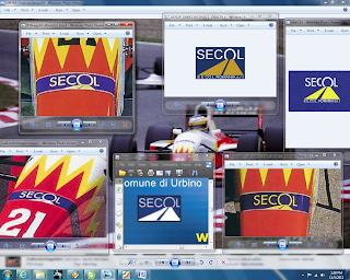
S.E.C.O.L.
SpA SOCIETA EDILE
COSTRUZIONI E LAVORI
Cannot
find italian website, http://www.secolromania.com/
Italian
construction company, tunnel builder
Looks like the font is "Tw Cen MT (Normal) (ENU)
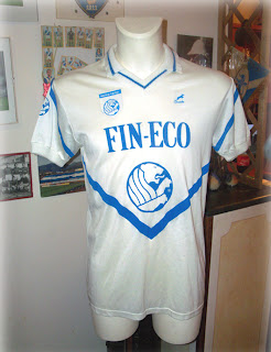
Fin-eco is a tough one too. They changed their logo a long time ago, and somehow they seem to have cleaned the internet of any trace of their old logo
They changed their logo to this, and this is all I can find on the web

Thankfully for me, they sponsored football teams in the 80s and 90s
And what do you know, a trademark search gets something similar
http://tess2.uspto.gov/bin/showfield?f=doc&state=4005:lqo1po.2.1
But it looks like the logos that appear on the A.C. Lumazzene jerseys are some different type of logo for this company.
So my first thought was this, I should find similar font, type out the logo, convert it to curves in Corel Draw and modify it make it accurate.
So I started looking for a similar font. I don't have anything close already installed on my PC. So I took to the web. There are sooooooo many fonts in the world, it's almost impossible to find just one. After getting pretty frustrated, I wound up using some tools.
WhatTheFont (http://new.myfonts.com/WhatTheFont/) is pretty cool. Load a lightly formatted image, and it will make some suggestions. Didn't find what I was looking for though.
Identifont (http://www.identifont.com/index.html) is also an interesting tool. Unfortunately, my sample of text was too small to make a good identification using the visual questions.
I learned quite a bit about different font characteristics. Some ways of describing fonts can be found here: http://www.fontshop.com/glossary/
Eventually, I wound up just browsing http://www.fontshop.com by category. And what do you know, I found the exact font.
http://www.fontshop.com/fonts/singles/itc/itc_korinna_heavy/
ITC Korinna Heavy. It's kinda unbelievable to me. I'm not a professional graphic designer, and I'm not really up on the history of logos, but it's a bit suprising to me that I'm two for two in identifying the exact typeface used. Maybe I should think again about logo creating and spend more time looking for fonts and less time trying to design logos from small blurry images. Making a box with a couple triangles and a line is not that big a deal. The letters are a ton of work though, if you have to do them yourself.
Ok, so the 1992 and prior logo would look something like this:
Looks like they changed it again for 1993. Much lighter letters. After some searching, I know it's not a very original thing to say...but Times New Roman? Probably not. I'll take a look for the "Service" font.
Which I can't find. So I'm going to have to wing it. My best guess? Cremona
That's the best I can do


No comments:
Post a Comment